
Banknote design sits at a rare intersection of art, engineering, and trust. A well designed note is not just something you spend. It is something you recognize instantly, feel confident using, and often pause to admire. Behind that small rectangle of paper or polymer is an enormous amount of thought, history, and technical skill.
More Than Decoration
At first glance, a banknote looks decorative. Look closer and you realize every line has a job. The design must deter counterfeiting, communicate value, reflect identity, and survive years of handling. Unlike posters or digital art, a banknote cannot rely on large areas of flat color or simple shapes. It needs depth, complexity, and redundancy built directly into the artwork.
This is why traditional banknotes lean so heavily on engraved line work. Fine lines, crosshatching, and micro patterns are extremely difficult to reproduce accurately without specialized equipment. Beauty and security are doing the same work.
Engraving as a Visual Language
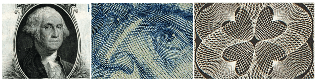
Classic banknote engraving is its own visual language. Portraits are built from thousands of tiny lines, not shading or gradients. Shadows are achieved through density, not darkness. Even backgrounds are rarely empty. They are filled with subtle textures, line screens, and guilloches that guide the eye while quietly adding protection.
Designers often talk about “reading” a banknote. Your eye moves from the portrait to the numerals, into the background patterns, and back again. That flow is intentional. Good notes feel balanced even when the layout is asymmetrical.
Guilloches, Microprint, and Hidden Detail
One of the most recognizable features of banknote design is the guilloche. These are the intricate geometric curves that weave and overlap in precise mathematical patterns. They look ornamental, but they are incredibly difficult to replicate without the original formulas and tools.
Microprint is another quiet workhorse. Text so small it looks like a line at normal size suddenly becomes readable under magnification. It rewards close inspection and punishes sloppy reproduction. Many modern designs combine these traditional techniques with new ones like latent images, color shifting inks, and fine dot patterns that behave differently under light.
Modern Banknotes and New Influences
While traditional engraving still anchors most currency design, modern banknotes have expanded the visual vocabulary. Polymer substrates allow transparent windows and bold color transitions. Abstract layouts and minimalist elements now sit comfortably alongside classical portraiture.
Even digital culture has started to influence banknote aesthetics. Circuit like line patterns, network inspired geometry, and layered transparency echo themes of technology and connectivity. These elements feel contemporary while still respecting the core rules of security printing.
Designing for Trust
Above all, a banknote must feel legitimate. Weight, texture, contrast, and detail all contribute to that feeling. If a note looks too simple, people question it. If it looks too busy without structure, it feels chaotic. The best designs strike a careful balance between complexity and clarity.
This is why banknote design changes slowly. Trends are filtered, tested, and refined over years, sometimes decades. Designers are not chasing novelty. They are protecting confidence.
Why Banknote Design Still Matters
In an increasingly digital world, physical currency remains a powerful symbol. It represents value you can hold, examine, and understand without a screen. Banknote design preserves centuries of craftsmanship while quietly adapting to new threats and new technologies.
For designers, it is one of the most challenging and rewarding disciplines there is. Every millimeter matters. Every line counts. And when done well, the result is something people carry every day without realizing they are holding a small, functional work of art.
-Lance

Leave a comment